Building applications that users enjoy is difficult. You need a lot of research, testing, designing and development efforts. Your applications must be fast, responsive and above all easy to use and understand. Your users shouldn't have to spend an extra second to think about how your application works and how to use it.
This becomes even more difficult when you need some form of input from your users. Nobody likes to fill those forms, It looks like more work to your users. And if you're not the right user experience practices then your forms may really suck. 😵
Here I have compiled a list of some tips are tricks that you can follow to ensure your forms are easy to use and provide a good user experience. 🤩
You can also check out this Figma Design that Provides a better visual: Forms UX Tips
1. Client-side Validation with inline messages
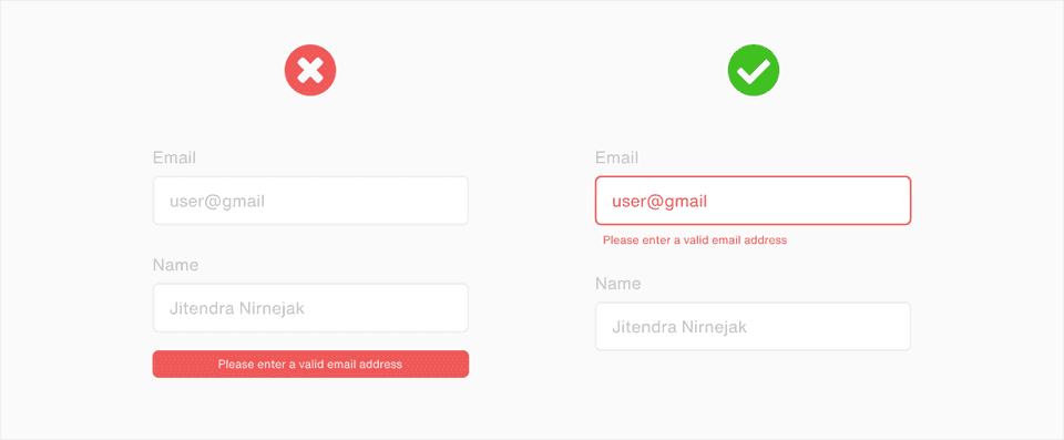
When you’re building forms you should provide client-side validation. Nothing sucks more than submitting the form and then waiting only to see you have entered something wrong. Your forms should be validated for the data type, input limits, and all the other factors. This will let your users see if they’ve entered something incorrectly and fix it before making requests to the server. Any type of validation error should be displayed near the input field i.e. inline. Instead of showing all the messages together or in the toast message.
2. Clear action buttons with right messages
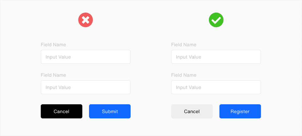
While building the forms you should always make sure the buttons which users will press after filling the form should be clearly labeled and distinguishable from each other i.e. the primary and secondary action buttons should be clearly visible. In the same way, providing too many action buttons is also not good. Too many action buttons will confuse the user and there is a chance that the user might press the wrong one.
3. Micro-interactions and feedback
A very simple trick to improve UX of your form is to add micro-interactions to your forms. Like when the user starts filling the form show some animation so that they can know they’ve started interacting with your interface.

4. Don't build large forms, break 'em down
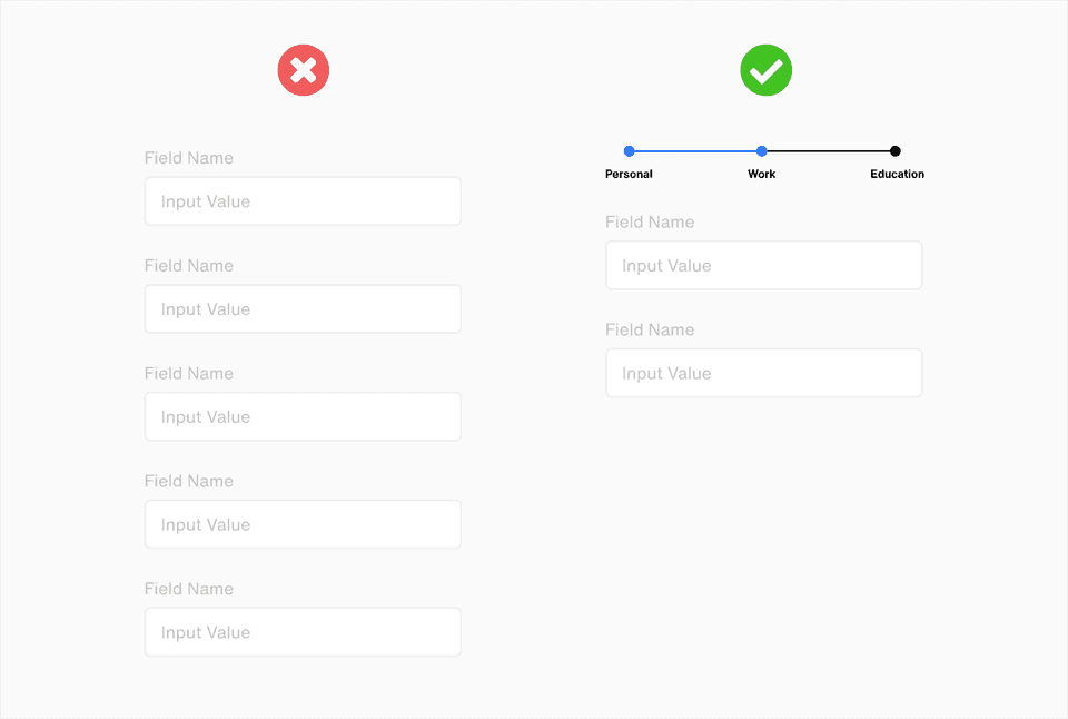
Have you ever seen pages with 10-20 input fields? Yea, Everybody hates that. It looks like too much work and nobody wants to fill those long forms unless they absolutely have to. But what if you really need a lot of input from users. Firstly reconsider your options. Ask for the data which is absolutely required. Then divide your form into multiple sections or steps. That way it won’t look like a huge task rather a small set of tasks which users can do one step at a time.
5. Use the right input field for the data type
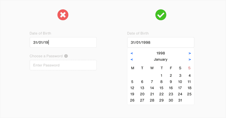
One of the mistakes you may make and not realize is you might be using the wrong type of input field. If you need your user to enter a date then add a date picker. If your app requires the user to enter a number then include number input with validation. You should also consider adding proper input fields for things like currency input, fractional inputs, preview for image input fields. Also, your placeholder text should also be meaningful. Also, don't forget to add tip icons (only when users can get confused).
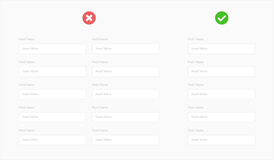
6. Don't build horizontal or multi-column forms
Avoid building horizontal forms. If your forms are in a single-column design, your user's eye will move naturally from the top to the bottom. Use a single column on small forms or group them in other cases.
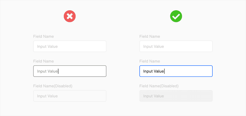
7. Clearly distinguish between different states of input fields
One of the mistakes developers/designers make is not able to properly distinguish different states of input fields. Different states of your input fields should be pretty obvious just by looking at it. These states include - hover, focused, disabled, there may be more or fewer states in your input field depending on its type.
I hope you learned some tips and tricks to design and build better input forms that your users are more likely to fill. I would recommend checking out the Figma Design below to get better Visuals of the Forms above, you can use it as a cheat sheet as well.
Thank you for reading
Build something awesome today! 🙌
Figma Design : Forms UX Tips
Contact us to work on your Front-End Development needs(React, Vue, Gatsby).
